Core/Dash Data Tables for Granular Analysis
Drill down from aggregate trends to specific bottlenecks. Identify the exact URLs and segments driving your performance metrics.
Using Data Tables for Granular Analysis
Charts are great for showing trends, but they can't tell you exactly what to fix. To make real improvements that impact your business, you need granular details. That's where the Data Table comes in.
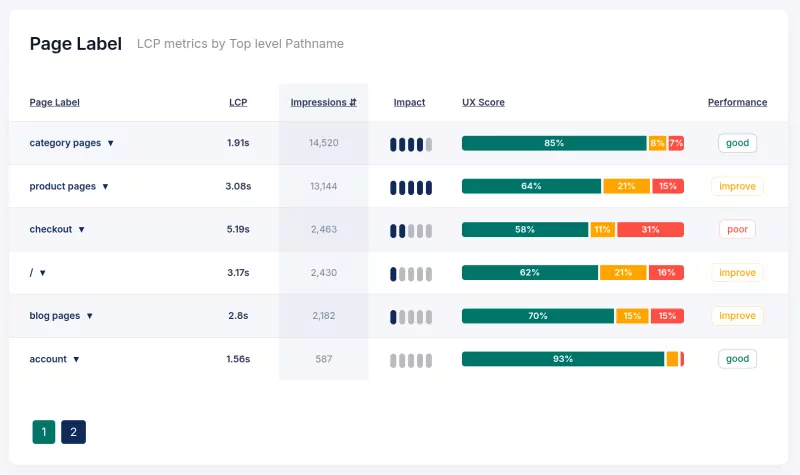
Data tables take the high-level signals from your dashboard and break them down into concrete line items. This is where you identify the specific URLs, user segments, or geographic regions causing performance drags, allowing you to build a precise, prioritized fix list.

The Anatomy of the Data Table
A data table is a multi-dimensional analysis tool. Understanding its columns is key to using it effectively:.
- Dimension (e.g., URL): The specific item you are analyzing (a page path, a device type, etc.). This is the "what."
- Metric (e.g., LCP): The performance score for that item. This tells you "how fast" (or slow) it is.
- Impressions: The volume of traffic for this item. This tells you "how many" users are seeing this performance.
- Impact Score: This is your priority indicator. It combines the metric score with traffic volume. A high Impact Score means a problem is both severe and affecting a lot of people. Fixing these yields the highest ROI.
- Distribution Bar: A visual "micro-chart" in every row. It shows the spread of user experiences (Good, Needs Improvement, Poor) at a glance, so you can spot patterns without clicking through.
Diagnostic Workflow
Don't just look at the data. Use it to drive decisions. Here is a proven workflow for identifying and fixing critical issues:
- Prioritize by Business Impact: Sort the table by the Impact column (descending). This immediately highlights the issues hurting the most users. Don't waste time optimizing a slow page nobody visits; fix the high traffic bottlenecks first.
- Spot Patterns Visually: Scan the Distribution Bars of your top issues. Is the bar mostly red? You have a consistent failure. Is it mostly green with a small red tail? You have an outlier issue (specific device or network). This visual context guides your next step.
- Filter to Isolate: Use filters to narrow down the problem. For example, if your LCP is high, filter by "Mobile" to see if the issue is specific to smaller screens (likely image sizing). Filtering removes noise and reveals the specific conditions causing the slowdown.
- Drill Down: Once you've identified a problematic URL or segment, use that insight to investigate further. Check the specific page template or assets associated with that URL to find the root cause.
This workflow turns a list of numbers into a clear action plan, ensuring your engineering time is spent on fixes that actually improve user experience and business metrics.
Optimizing Core Web Vitals
Data tables bridge the gap between problem identification and resolution. By focusing on Impact and using the granular data provided, you execute surgical optimizations that deliver measurable results for your users and your business.

