Core/Dash Analyzing Trends with Time-Series
We optimized our infrastructure so you don't overpay for yours. We offer high quality Core Web Vitals monitoring without the marketing overhead!
Trusted by market leaders · Client results
Analyzing Trends with Time-Series Charts
Static scores hide volatility. A single aggregate number averages out the chaos of a live production environment. The Time-Series chart exposes that volatility by mapping metric performance against a temporal axis.

Use this view to establish a performance baseline and detect deviations. It serves as your primary tool for correlating engineering activities with user experience shifts.
Chart Anatomy
The chart constructs a narrative of stability using four technical components:
- Metric Axis (Y): The magnitude of the latency (milliseconds) or score (0-1). Lower values indicate better performance.
- Temporal Axis (X): The timeline of data collection. This aligns with your infrastructure logs and deployment history.
- Trend Line: The plotted p75 aggregate for each time interval. This line represents the experience of the majority of your users.
- Threshold Zones: Horizontal guides marking the Core Web Vitals limits (Good, Needs Improvement, Poor). These zones provide immediate context regarding compliance with Google's ranking signals.
Diagnostic Patterns
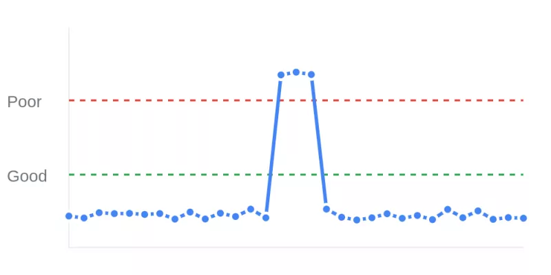
- Step-Function Regressions (Spikes): A near-vertical ascent indicates a sudden introduction of latency. This pattern typically correlates with a specific code deployment, configuration change, or third-party tag injection. Check your commit history for merges that align with the timestamp of the spike.
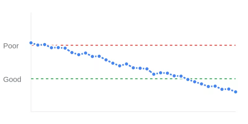
- Optimization Validation (Drops): A sustained drop in the trend line confirms the efficacy of a performance patch. Use this pattern to verify that a fix (such as enabling text compression or deferring scripts) has impacted the production environment as intended.
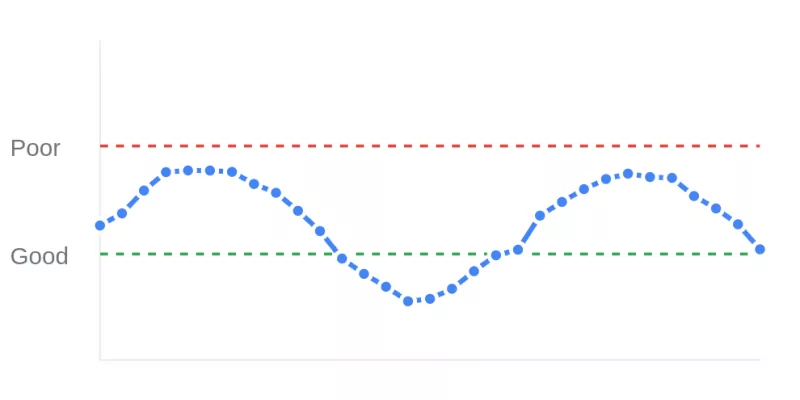
- Cyclical Variance (Patterns): Regular, repeating fluctuations suggest load-based bottlenecks. A trend line that spikes during peak traffic hours or specific daily intervals often points to database contention or insufficient autoscaling rules.
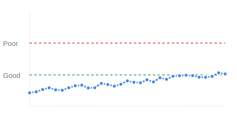
- Performance Drift (Creep): A gradual, low angle ascent over weeks indicates accumulated technical debt. This pattern results from the slow addition of unoptimized assets or minor inefficiencies that compound over time.


Investigation Workflow
The Time-Series chart acts as the trigger for deeper analysis. Identify the anomaly on the timeline. Note the specific timestamp and magnitude of the shift. Apply Filters for device, country, or page type to determine if the anomaly is global or isolated to a specific segment. This isolation process narrows the scope of the investigation and guides the engineering team to the relevant code module.
Improving the Core Web Vitals
Continuous monitoring transforms performance from a periodic concern into a managed engineering constraint. Use the Time-Series chart to maintain vigilance over production stability and ensure that every deployment maintains or improves the established baseline.

