Main RUM Dashboard
Understand how Core/Dash can help improve the Core Web Vitals and stay fast without regression!
The Main RUM Dashboard Overview
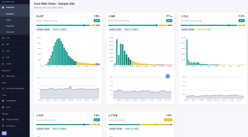
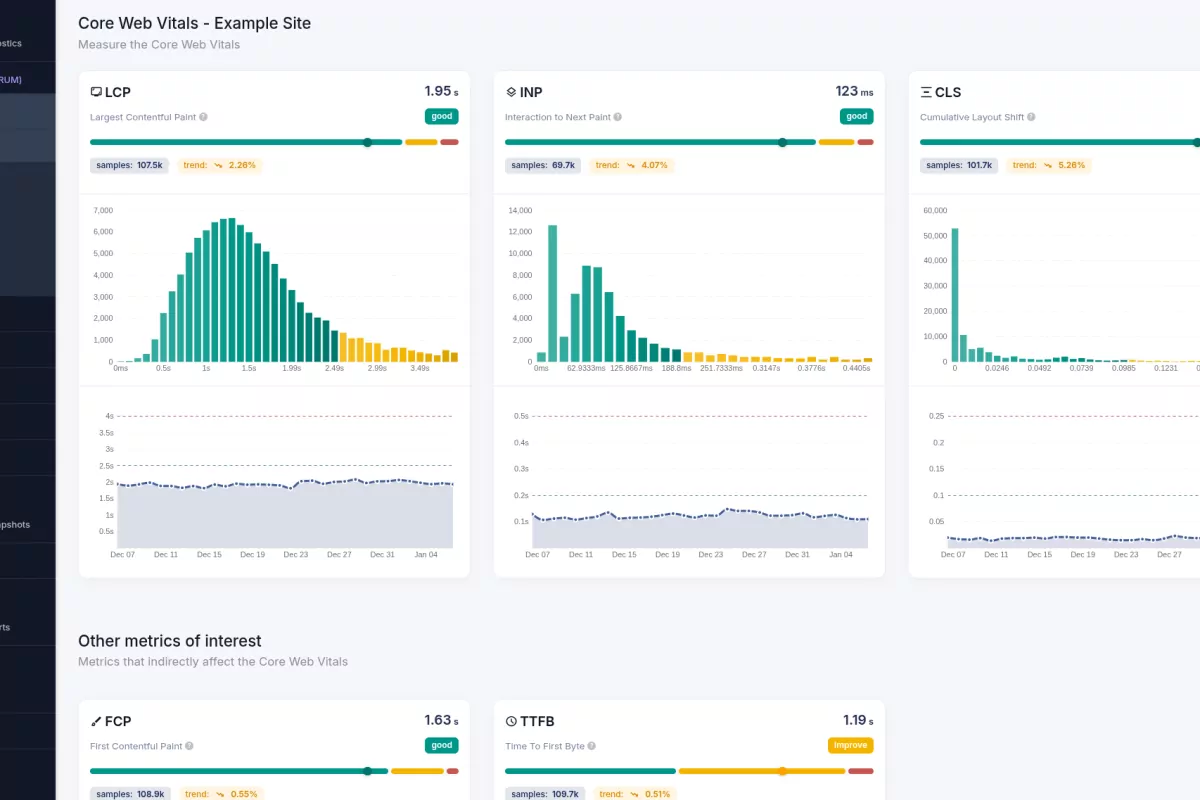
The Main RUM Dashboard is the primary entry point for your performance infrastructure. It provides an immediate, real-time status of your Core Web Vitals (INP, LCP, CLS), visualizing user experience through three distinct lenses: a Timeline, a Histogram, and a Distribution view.

This is your daily command center. It replaces anecdotal "it feels slow" reports with undeniable real-time data. If your users are experiencing regressions, you will see it here first.
The Three Core Visualizations
TTe dashboard organizes data into three critical components, each answering a different question about your site's health:
- Timeline (Time-Series): This chart tracks the evolution of your metrics over the selected period (default: 7 days). It answers "When did performance change?" Use this to correlate latency spikes with specific code deployments or content updates. A flat line means stability; a spike means regression.
- Histogram (Frequency): The histogram displays the volume of page loads that fall into specific latency buckets (Good, Needs Improvement, Poor). It answers "How many users are affected?" This validates the severity of an issue. A high p75 LCP is urgent, but seeing thousands of users in the "Poor" red bucket confirms the business impact.
- Distribution (Statistical Spread): This view visualizes the full range of user experiences, from the fastest 10% (p10) to the slowest 1% (p99). It answers "Is the problem systemic or isolated?" Use this to determine if a slowdown affects everyone or just the "long tail" of users on constrained devices.
How to Use The Dashboard Effectively
Make data-driven decisions by checking these views in order:
- Daily Triage (Timeline): Check the timeline every morning. If the line for LCP or INP is trending upward, investigate immediately. Catching a regression 12 hours after deployment is better than waiting for the 28day CrUX report.
- Impact Assessment (Histogram): When you see a spike, check the Histogram. Are you seeing a small shift in the "Needs Improvement" bucket, or a massive jump in "Poor"? This tells you whether to hotfix immediately or schedule a task for the next sprint.
- Deep Dive (Distribution): Use the Distribution view to understand the variance. If the p75 is fine but the p95 is terrible, you likely have a specific bottleneck affecting older devices or slow networks.
The Timeline alerts you; the Histogram quantifies the damage; the Distribution guides the fix.
Making Data-Driven Decisions
Core/Dash measures real user experiences, not simulations. By monitoring these three dimensions in real-time, you ensure that every optimization you ship yields a measurable improvement for your actual users, directly impacting your SEO rankings and conversion rates.

