Core/Dash Histograms
Visualize the full distribution of user experiences. Identify outliers and bimodal patterns that averages hide.
Trusted by market leaders · Client results
Understanding User Experience with Histograms
Average performance scores are misleading. They hide the reality of user experience. If one user loads your site in 1 second and another loads it in 9 seconds, the average is 5 seconds. This number represents neither user. A histogram reveals the truth by visualizing the full distribution of load times.

This chart moves you from a single metric to a complete picture. It exposes the outliers, the long tail, and the specific groups of users who are having a poor experience.
What a Histogram Reveals
A histogram groups your performance data into buckets to show frequency.
- X-Axis (Buckets): Ranges of performance scores (e.g., 0-1s, 1-2.5s).
- Y-Axis (Volume): The number of page views that fall into each bucket. The height of the bar indicates how common that experience is.
- Percentiles (p75, p90, p99): These markers show where the majority of your users sit. The p75 line indicates that 75% of your traffic is faster than this point.
How to Diagnose Problems with a Histogram
A healthy histogram has a large concentration of users in the fast buckets on the left and a short, steep drop-off. Any other shape is a red flag that demands investigation.
- The Long Tail: Look for a graph that extends far to the right with low bars. This represents a "long tail" of users with very poor performance. These are often users on older devices or slow networks. Minimizing this tail improves your p95 and p99 scores.
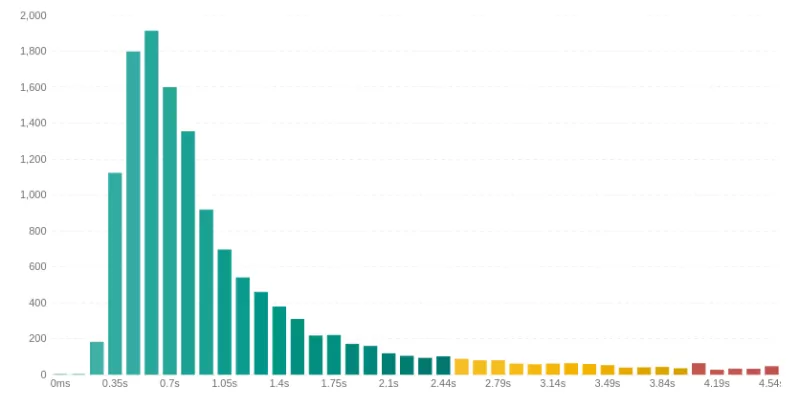
Fix: Focus on optimizing for constrained environments by reducing JavaScript execution and asset sizes. - Bimodal Distribution (The Double Peak) Look for two distinct peaks in the chart. This indicates two different user experiences. It is often caused by a segmentation issue, such as mobile vs. desktop or cached vs. uncached pages.

Fix: Use the Filters to isolate the variable. Filter by device type, logged-in status, country etc until you have found the the dimension that makes one of the peaks disappear. You've just found the root cause of the problem for an entire cohort of users.


Optimizing Core Web Vitals
The histogram forces you to confront the reality of your slowest users. Analyzing the distribution is the key to moving from general optimization to surgical improvements that lift your p75 scores and drive business results.

