Core/Dash Visualizing Global Performance
We optimized our infrastructure so you don't overpay for yours. We offer high quality Core Web Vitals monitoring without the marketing overhead!
Visualizing Global Performance with Geo Maps
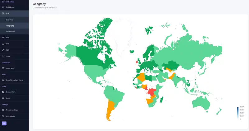
Distance equals latency. The further your user is from your origin server, the slower their experience. The Geo Dashboard visualizes this reality by breaking down your Core Web Vitals performance by country. It transforms abstract metrics into geographic intelligence.

Use this view to audit your global infrastructure. Identify where network latency is degrading user experience and validate the effectiveness of your CDN strategy.
The Visualization: Map and Table
The dashboard provides two complementary views of your global traffic:.
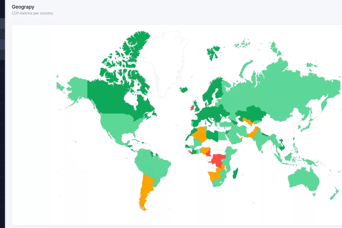
- The Heatmap: This gives you immediate pattern recognition. Countries are color-coded based on performance thresholds (Green = Good, Red = Poor). A quick glance reveals if a latency issue is isolated to a specific region or systemic across the globe.
- The Data Table: This provides the precision needed for analysis. It lists every country with traffic, displaying the exact p75 values for all Core Web Vitals (LCP, INP, CLS, FCP, TTFB). You can sort this table to find your slowest regions or high-traffic markets that are underperforming.
Metric Strategy: What to Look For
Different metrics fail for different reasons when viewed geographically. Here is how to interpret the data:
- Time to First Byte (TTFB): This is your proxy for network latency and server distance. If TTFB is low in your home region but high in Asia or South America, your origin server is too far away. This indicates a need for a CDN or edge caching.
- Largest Contentful Paint (LCP): While affected by TTFB, LCP is also sensitive to bandwidth. High LCP in regions with slower average internet speeds suggests your assets (images, videos) are too heavy for those networks.
- Interaction to Next Paint (INP): This metric correlates with device capability. High INP in specific developing markets often points to a prevalence of lower end Android devices struggling with heavy JavaScript execution.
Optimizing Core Web Vitals
Turn this data into infrastructure improvements.
- Identify the Red Zones: Start with the map. Spot the regions with poor performance.
- Diagnose with the Table: Check the specific metrics for those regions. Is it a TTFB issue (server distance) or an LCP issue (asset weight)?
- Fix the Core Web Vitals: High TTFB: Deploy a CDN Point of Presence (PoP) in that region or cache HTML at the edge. High LCP: Optimize image compression or implement adaptive serving based on network conditions.

